In today's hyper-competitive marketplace, a compelling brand identity is not just a business asset; it's a necessity for standing out. Branding and design are at the heart of a company's identity, reflecting its values, mission, and personality. A strong brand communicates to customers who you are, what you stand for, and why you deserve their attention. However, creating a standout brand is fraught with challenges, and common mistakes can undermine your efforts. This guide outlines five critical mistakes to avoid in branding and design, ensuring your brand not only resonates with your audience but also shines brightly in a crowded market.
Mistake 1: Neglecting Brand Consistency
Consistency is King
Inconsistency across brand touchpoints can confuse customers and dilute brand equity. Whether it's your website, social media, or packaging, every interaction should reinforce your brand identity.
Strategies for Consistency:
- Develop a comprehensive brand style guide covering logos, color palettes, typography, and tone of voice.
- Regularly review and update all branded materials to ensure alignment with your brand guidelines.
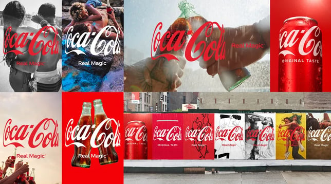
Case Study: Coca-Cola Coca-Cola's brand consistency across global markets is legendary. Despite cultural variations, its consistent messaging and visual identity make it one of the most recognized brands worldwide.

Mistake 2: Overcomplicating Your Design
Simplicity Sells
A simple, clear design is more likely to be remembered than a complex one. Overdesigning can overwhelm your audience and obscure your brand message.
Achieving Minimalism:
- Use clean lines and ample white space to enhance visual appeal and readability.
- Focus on one or two design elements that effectively communicate your brand essence.
Example: Apple Apple is synonymous with minimalist design, from its product design to marketing. This simplicity has played a crucial role in establishing its premium brand status.

Mistake 3: Ignoring Target Audience Preferences
Know Your Audience
Designing without a deep understanding of your target audience's preferences and behaviors is like shooting in the dark. Your brand should speak directly to their needs, aspirations, and lifestyle.
Understanding Your Audience:
- Conduct market research to gain insights into your audience's preferences.
- Tailor your branding and design elements to resonate with your target demographic.
Success Story: Netflix Netflix tailors its content and user interface based on viewer preferences, demonstrating an understanding of its audience that has contributed to its global success.

Mistake 4: Underestimating the Power of Color Psychology
Color Conveys Meaning
Colors evoke emotions and associations. Choosing the wrong color palette can send unintended messages to your audience.
Choosing the Right Colors:
- Select colors that align with the emotions and traits you want associated with your brand.
- Consider cultural differences in color perception when targeting international markets.
Case Study: Tiffany & Co. The iconic "Tiffany blue" evokes feelings of luxury and exclusivity, perfectly aligning with the brand's upscale image.

Mistake 5: Failing to Evolve Your Brand
Stay Relevant
Markets, trends, and consumer preferences evolve, and so should your brand. An outdated brand can appear out of touch, risking customer engagement and loyalty.
Evolving While Maintaining Essence:
- Regularly assess your brand's relevance and resonance with your audience.
- Undertake a brand refresh that updates your look without losing your core identity.
Example: Old Spice Old Spice revitalized its brand by updating its image and messaging, appealing to a younger demographic without alienating its existing customer base.

Conclusion: Crafting a Brand That Stands the Test of Time
Avoiding these five mistakes in branding and design is crucial for developing a strong, enduring brand identity. By ensuring consistency, embracing simplicity, understanding your audience, leveraging color psychology, and staying adaptable, your brand can stand out and make a lasting impression. Remember, a standout brand is not just seen—it's remembered and cherished.


