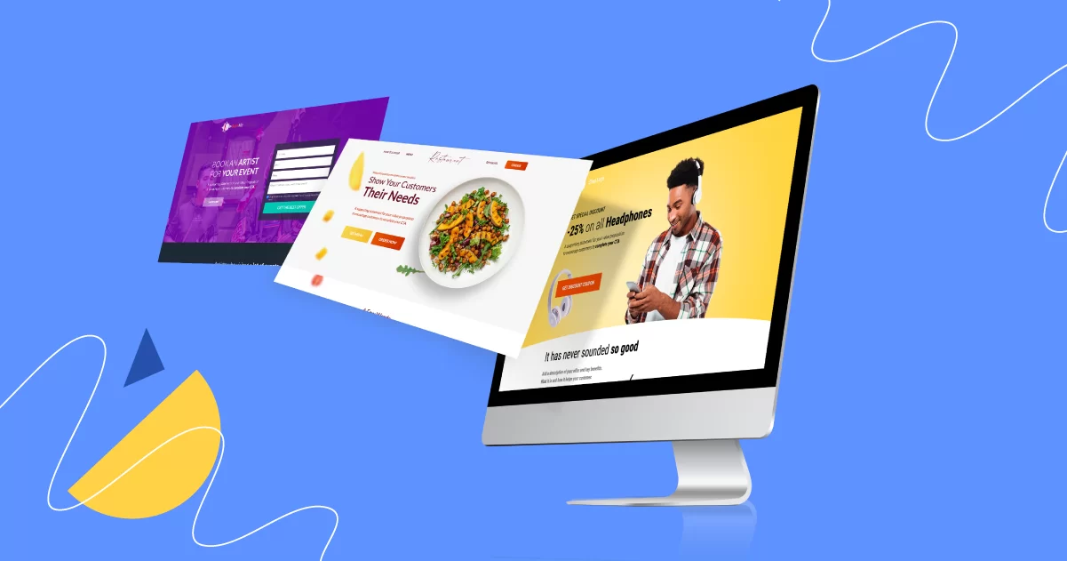
Creating a landing page that turns visitors into customers isn't magic—it's all about knowing the right ingredients to use. Think of your landing page as a recipe. Just like in cooking, you need the right mix to make everything come together perfectly. Here's how you can create a landing page that not only looks good but also sells.
1. Understand Your Audience
Before you start designing, you need to know who you're designing for. Think about who will visit your page and what they want. This will help you make something that speaks directly to them.
- Who are they? Imagine who your potential customers are, including their challenges and goals.
- What do they need? Highlight how your product or service uniquely addresses their pain points.
- How can you help? Use language and imagery that resonate with your audience, making your offer irresistible.
2. Keep It Simple
A visually cluttered page can overwhelm visitors. Opt for a clean, focused design that guides them towards your desired action.
- Visual Hierarchy: Use design elements to draw attention to key areas, like your value proposition and CTA.
- Responsive Design: Ensure your page looks great and functions seamlessly on any device, enhancing user experience.
- Speed Optimization: A fast-loading page keeps potential customers engaged and reduces bounce rates.
3. Make It About Them
Your landing page should focus on how your product or service benefits the visitor. Instead of listing features, explain how it makes their life better or solves a problem.
- Value Proposition: Clearly articulate the unique benefits of choosing your solution over competitors.
- Social Proof: Incorporate testimonials and case studies to build credibility and trust among prospective customers.
- SEO-Optimized Copy: Integrate relevant keywords naturally to improve search engine visibility without compromising readability.
4. A Clear Call to Action (CTA)
Your CTA is perhaps the most important part of your landing page. This is where you tell visitors what you want them to do next.
- Visibility: Ensure your CTA button stands out with contrasting colors and is placed prominently on the page.
- Action-Oriented Language: Use verbs that encourage action and make the next steps clear and appealing. Instead of "click here," use action words like "Get started," "Buy now," or "Sign up free."
- A/B Testing: Experiment with different CTA texts, colors, and placements to find what works best for your audience.
Conclusion
The secret to a successful creative landing page isn't so secret after all. It's about understanding your audience, keeping things simple, focusing on benefits, and having a clear call to action. With these ingredients, you'll be well on your way to creating a landing page that converts visitors into customers.
Before you go, check out our other blogs for more tips on Website Development success:
- 7 Essential Website Launch Strategies for Your Business
- The Best Ecommerce Web Design Trends to Adopt in 2024
- Corporate Website Development: 5 Key Strategies to Enhance User Experience
These resources will give you more insights into creating a comprehensive online presence that meets your audience's needs and exceeds their expectations.


